 |
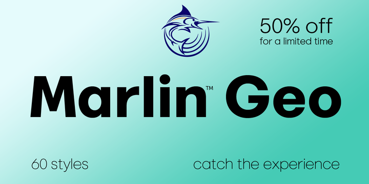
FontMesa is pleased to introduce our latest sans serif type font design Marlin Geo.
Ten years ago we set out to make you a good clean multiple weight font family, with each new release our goal was to improve and refine our work making each font family better than the next.
It's been a long journey in creating for you the customer the best product possible.
Marlin Geo is FontMesa's best work yet, it's spot on perfect, painstaking effort has gone into making sure the letter shapes have been crafted simple and clean the way they should be.
Marlin Geo is your classic everyday use sans serif that's packed with alternate letters that I'm sure you're going to enjoy.
Marlin Geo comes with two sets of italics, the standard 12° italic and a 6° slant version that's perfect for headlines and signage where you may want the look of an italic with half the slant.
Marlin Geo offers two versions, the regular which has round dots, periods and accents and the SQ version which includes square dots, periods and accents.
Both versions include the same set of stylistic alternates which you will need an opentype aware application such as Adobe Illustrator to access the alternate glyphs in Marlin Geo.
Within Marlin Geo is one alternate letter that I'm pretty fond of, you'll notice it right away as a slightly rotated G, I'm sure you'll find the perfect project to use it on.
You'll also find alternates in Marlin Geo that allow you to go without descenders on the g, j, q, y.
Right about now you're probably wondering what the sets of three lines are for in Marlin Geo?
They're wings, hard or rounded, simply type out a name or word then place a wing on each side or use the center wing with each side wing and layer a word over the top.
You'll also find a Unicase E in Marlin Geo, when creating the uppercase Schwa glyph I thought, well why not flip it over and add it as a Unicase letter which perfectly compliments the geometric style of this font?
What about the numbers in Marlin Geo? Does it have oldstyle and tabular figures? don't worry about it we've got you covered.
In saltwater fishing the Marlin fish is considered the King of the ocean and a royal symbol in some cultures.
So put on your flip flops then explore and discover the possibilities the all new Marlin font family has to offer.
This next part is a story I'd like to share with you, it's about a man named Ric.
Six years ago on a warm summer day I was cleaning out my garage and putting junk out on the curb for garbage pick up, a couple of hours went by and a man pulls up in his pickup truck, he gets out and starts looking through my garbage for anything he could sell at a yard sale.
I invited him to come back to my garage to see if there was anything else he wanted for his yard sale, he accepted and backed his truck into my driveway.
He was a man in his late sixties or early seventies with what appeared to be advanced arthritis in his knees so it took him a while to walk down to my garage.
As we where loading items into his truck he asked me what I did for a living, I said that I work in pool construction and design type fonts, the man's eye light up with excitement, he said I'm Frederic Goudy's great nephew, I was named after my uncle, Goudy is my middle name but you can call me Ric.
Frederic Goudy Bendel is his name aka Ric Bendel, Ric is a jazz musician in the Chicago area, he came by for a couple more weekends and helped me clean more junk out of my garage.
I wish I had more time to sit and talk with Ric, however, care giving for family was still a big part of my life at the time.
I like to dedicate Marlin Geo to Ric Goudy Bendel, thanks for helping me clean out my garage.
Additional thanks goes to Octavio Pardo and Eben Sorkin for showing me the right way to make multiple weight type fonts.
Marlin is a trademark of FontMesa LLC